Choosing paint colors seems easy until you’re faced with hundreds of similar shades. What looks like the perfect color in a store can appear completely different once it’s on your walls. In addition, lighting varies during the day; furniture can affect how colors are perceived, and the size of the room can make a difference in the color experienced.
This leads many homeowners to have color schemes that are too dark, too light, or not cohesive with the rest of the home. Paint is one of the most noticeable design elements in any room.
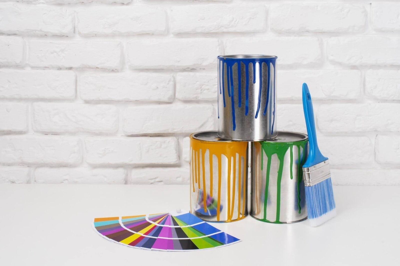
Understanding a few basic color principles can make the selection process much easier. This article outlines how to select interior paint colors that match your decor, work for your needs, and create a seamless feel throughout your home.
1. Start By Understanding the Purpose of the Room
Prior to choosing colors, consider how the space is utilized on a daily basis. Various areas are used for different purposes, and their colors should reflect this.
For instance, many homeowners with an interior painting project opt for calming colors in bedrooms, as they help promote relaxation. Living rooms, however, can be quite warm and cozy.
Also, home offices often benefit from colors that promote focus and productivity. If you coordinate color selections with the room’s intended function, it will seem more purposeful and functional.
2. Evaluate Natural and Artificial Lighting
Great lighting can make a huge difference in how paint appears. So, always weigh the quantity and direction of natural light before deciding. Rooms with large south-facing windows are generally well-lit and tend to be sunnier, with more colors.
Conversely, cooler light may be found in rooms facing north, which can make some shades appear darker. Color perception is also impacted by artificial lighting. Cooler bulbs might show more blue or gray tones, while warm bulbs will give warmer tones.
These differences mean it’s best to test paint samples at different times of day to avoid costly mistakes. Experts always say it’s best to view samples under different lighting conditions to ensure the right color.
3. Take Into Account Current Furniture & Finishes
The paint you choose should complement the existing elements in your house. The appearance of a room is affected by the flooring, cabinetry, countertops, furniture, and decorative accents that are used.
The first step is to determine what the predominant color and tone are in the space. For example, wood flooring can be warm or cool-toned. The type of paint you choose should enhance rather than compete with those features.
Also, careful complementary color schemes will give a more refined appearance. Paint complements the furnishings and architectural features, creating a harmonious and aesthetically pleasing atmosphere.
4. Use Color Psychology to Create the Desired Mood
Color has an emotional impact on a room. Although it’s a matter of personal taste, it’s helpful to be familiar with a few principles of color psychology.
Soft blues can help to give a serene feel. Green is the color of balance and freshness. Beige colors are warm and can create a comfortable, welcoming environment. At the same time, navy and charcoal can add depth and sophistication to a space.
But when used carefully, bold colors are the most effective. Avoid painting a wall a deep, dark color; use it to accent a wall instead. Also, consider the ambiance or atmosphere you wish to achieve in the space before you make your decision.
5. Test Samples Before Making A Final Decision
Many paint selection mistakes occur because homeowners skip the sampling stage. Although paint chips provide a starting point, they cannot fully represent how a color will appear across an entire room.
Instead, apply sample colors directly to multiple wall sections. Observe them throughout the day as natural and artificial lighting changes. This process reveals undertones that may not be noticeable initially.
Moreover, testing allows you to compare several options side by side. Taking time to sample colors helps ensure confidence before investing in a full paint project.
6. Create Flow Between Connected Spaces
Individual rooms should have their own character, yet the entire home should still feel connected. Therefore, consider how colors transition from one space to another. Using a consistent color family throughout the home creates visual continuity.
Open-concept layouts especially benefit from coordinated palettes, which help maintain harmony while allowing each room to serve its purpose. A cohesive palette also contributes to a more refined and professionally designed appearance.
Final Thoughts
Choosing the right interior paint colors involves more than selecting a shade you like. Instead, it requires understanding how lighting, room function, furnishings, and color psychology work together.
Additionally, testing samples before making a final decision helps avoid costly mistakes and ensures greater satisfaction with the finished result. Creating a consistent color flow between connected spaces further improves the overall appearance of your home.
When these factors are carefully considered, your paint choices feel intentional and balanced. Ultimately, the best interior paint colors are those that support your lifestyle, complement your surroundings, and create an environment that feels comfortable, attractive, and timeless for years to come.