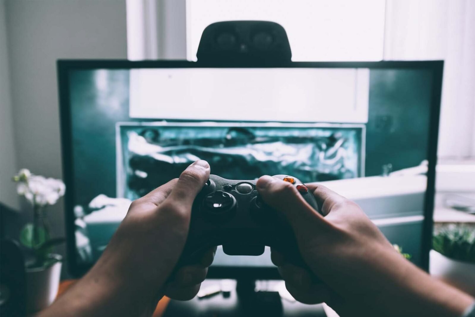
Princeton psychologists found that people form a stable first impression in as little as one-tenth of a second – and that additional exposure rarely changes it. Games face the same reality. Before a player reads a description, watches a trailer, or taps through a tutorial, they have already made a gut judgment about whether the experience feels worth their time. That judgment is almost entirely visual, and it happens faster than conscious thought can intervene.
For anyone building or funding a game, this is not an abstract concern. In a market where 57% of top games ran A/B tests on store screenshots at least twice in 2024, the studios winning on first impressions are not doing it by accident. They are making deliberate production choices that shape how players feel before a single mechanic is explained.
This guide covers what those choices are and why each one matters more than it first appears.
Why First Impressions in Gaming Are Different From Other Media
A film viewer commits to sitting down. A book reader opens to page one. A game player is making a rapid series of go or no-go decisions: does this icon look interesting? Does the splash screen feel polished? Does the opening scene give me a reason to stay? Each micro-judgment feeds into the next, and the cumulative effect determines whether someone continues playing or quietly exits.
The problem is that most of these judgments happen below the threshold of reflection. Players rarely articulate why they stopped playing in the first few minutes – they simply stop. The emotional signal that drives the decision is formed in the first seconds, and everything afterward is just confirming or contradicting it.
6 Ways to Win Players in the First 3 Seconds
1. Design an Icon That Does More Than Identify the Game
The app icon is the very first visual asset a potential player encounters – before the store page, before the screenshots, before any description. On Google Play, it is often the only visual element visible in search results. Getting it right is not optional.
A strong game icon does several things simultaneously:
- Signals genre instantly – players should be able to guess what kind of game it is without reading the title
- Uses color contrast deliberately – high-contrast icons consistently outperform muted or complex ones in app store testing environments
- Works at small sizes – detail that looks impressive at full size often becomes illegible at the 60×60 pixels of a search result
- Feels consistent with the in-game visual identity – an icon that looks nothing like the actual game creates trust issues before the player has even installed it
A/B testing data consistently shows that optimized icons can increase conversion rates significantly – in some cases doubling them. Yet many studios treat the icon as a last-minute deliverable rather than a strategic asset worth iterating on.
This is exactly where professional 2D art services make a tangible difference. The icon, splash screen, and character first impressions that greet a player are not technical problems – they are craft problems, and the quality of execution directly determines whether someone stays to discover what the game actually offers.
2. Make the Splash Screen Feel Like an Invitation
The splash screen is the game’s opening handshake. It appears before the player has done anything, which means it carries the full weight of establishing tone, quality, and visual identity without the support of gameplay or narrative context.
A weak splash screen communicates carelessness instantly. Poor typography, generic stock-style backgrounds, inconsistent art direction, or an overly corporate logo treatment all trigger the same subconscious response: this game was not made with care.
What a strong splash screen communicates:
- A clear sense of the game’s visual world – the color palette, the art style, the emotional register
- Production confidence – the kind of deliberate composition and lighting that signals the whole game was made at this standard
- Something worth waiting for – a hint of character, world, or mystery that makes the player curious about what comes next
The splash screen should never be an afterthought assembled from existing assets. It is, quite literally, the first thing players see, and it functions as a promise about everything that follows.
3. Introduce Your Protagonist Before You Introduce Your Mechanics
Players connect with characters before they connect with systems. A character whose design communicates personality, history, and emotional state immediately creates a hook that pure gameplay explanation cannot replicate in the same timeframe.
Character design for first impressions should address:
- Silhouette readability – a strong character silhouette is recognizable even at small sizes and in motion, which matters for both in-game use and marketing assets
- Visual personality shorthand – clothing, posture, color choices, and proportions should communicate who this character is before a single word of dialogue
- Emotional expression – the character’s default state should project something the player can respond to: confidence, vulnerability, curiosity, danger
Research on player engagement consistently shows that audio-visual elements have the highest impact on first impressions for casual player segments. Character design is the single most human element in that package.
4. Use Sound Design as a Confirmation Signal
Sound does something visuals cannot: it confirms that the world is real. A polished visual presentation undermined by generic, flat sound design creates a dissonance that players register immediately, even if they cannot name it.
In the first three seconds, audio contributes to the impression in specific ways:
- The startup sound or jingle sets an emotional tone before any image registers fully
- UI sound effects tell players whether the interface has been crafted or assembled – a satisfying tap sound signals care; a default click signal indifference
- Ambient audio in the opening scene or menu communicates whether the game world has depth beyond what is visible
The studios that treat audio as a parallel investment to visual production consistently produce games that reviewers describe as “polished.” Those that budget audio as an afterthought create the opposite impression, which is sticky once formed.
5. Write a UI That Feels Like Part of the Game
The user interface is often where first impressions collapse in games that look strong in screenshots but feel flat in the first minute of play. When the visual style of the UI does not match the visual style of the game world, the result is a jarring disconnect that signals inconsistency in the production.
A well-designed game UI in the first minutes of play:
- Uses fonts, colors, and iconography that feel native to the game’s art direction – not borrowed from a default template
- Communicates clearly without competing with the game world for visual attention
- Responds to input with satisfying immediacy – slow or jerky UI feedback undercuts confidence in the whole experience
- Scales correctly across device sizes – a UI that breaks on certain screen ratios signals that the product was not thoroughly tested
The quality bar for UI design has risen considerably as players spend more time comparing experiences across platforms. An interface that would have seemed acceptable five years ago now reads as unfinished.
| UI Element | What Good Looks Like | What Players Register When It’s Wrong |
| Fonts | Consistent with art style, readable at all sizes | Generic, mismatched, or hard to read quickly |
| Color palette | Drawn from the game’s visual language | Feels like a different product overlaid on the game |
| Button responsiveness | Instant, satisfying feedback | Sluggish or silent – erodes confidence in quality |
| Icon design | Clear, purposeful, game-appropriate | Clipart-style or inconsistent across the interface |
| Menu transitions | Smooth, intentional | Jarring cuts or placeholder animations |
6. Earn Curiosity Before You Explain Anything
The most common mistake in game onboarding is trying to teach the player before the player has decided to stay. A tutorial that appears before the game has earned emotional investment is asking for commitment from someone who has not yet been given a reason to care.
The first three seconds – and arguably the first three minutes – should prioritize curiosity over comprehension. This means:
- Dropping the player into a moment rather than a menu: an establishing shot, a character in motion, a world that implies a story already in progress
- Withholding just enough to create a question the player wants answered: where am I, who is this, what just happened
- Trusting visual storytelling to do the work that tutorial text tries to do explicitly
Games that open with a system explanation are asking players to invest attention before earning it. Games that open with a moment are offering something first. The distinction sounds small. In practice, it is the difference between a player who stays for ten minutes and one who quits in three.
The Production Decisions That Shape First Impressions
For anyone making decisions about game production priorities, the first three seconds are worth taking seriously as a design problem – not a marketing one. The players who fall in love with a game in the first moment do not know why they stayed. But the production choices that kept them were made deliberately, long before they hit play.
FAQ
What is the most cost-effective visual element to invest in for a first impression? The icon and splash screen consistently deliver the highest return for the investment, particularly for mobile and PC titles. They require relatively limited asset production compared to a full character or environment pipeline, but they are the first elements players encounter and disproportionately influence whether someone continues to the next step.
Can a stylized or minimalist art style make a strong first impression? Absolutely. Art style is not the variable – consistency and intentionality are. A pixel art game with a coherent, well-executed visual identity reads as polished. A realistic-style game with inconsistent lighting and generic UI reads as unfinished. Players respond to craft, not photorealism.
How do studios test whether their first impressions are working? A/B testing different icons, screenshots, and store page visuals against measurable conversion metrics is the most direct method. For the in-game experience, early playtest sessions focused specifically on the first five minutes reveal where players disengage – which is often earlier than developers expect.
Does the game’s store page description matter as much as the visuals? Not for first impressions. Research on app store behavior consistently shows that visual assets – icon, screenshots, video preview – drive the initial decision to explore or download. Description text matters for players who are already interested and want to confirm their decision. It rarely converts someone who was not already drawn in by the visuals.
What is 2D game art development typically responsible for in the first-impression pipeline? Character design, UI elements, splash screens, icon design, background illustrations, and all flat visual assets that players encounter before and during the opening experience. In games with a 2D art style, this covers essentially the entire visible product – which is why the quality and consistency of that work shapes the first impression so completely.