
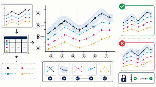
A chart screenshot can be difficult to read because it is small, compressed, or exported with weak contrast. Enhancement seems harmless. Then an axis tick shifts, two series merge, a thin line disappears, or the crisp candidate places an intersection where the source never had one.
Charts are geometry built from data. Readability work must preserve the coordinate system, series order, labels, uncertainty marks, and every plotted relationship. A plot-geometry checksum makes those properties reviewable.
Freeze the Data and Rendering Context
Obtain the source data and the chart specification or export settings when available. Record chart type, dimensions, axis scales, units, ranges, series order, colours, labels, legend, annotations, smoothing, and data period. A screenshot alone cannot explain whether a curve is raw, aggregated, or interpolated.
Save an authoritative vector or high-resolution export before editing a screenshot. If the chart can be re-rendered cleanly from source, use that route. Image enhancement is a fallback for an otherwise fixed asset, not a replacement for the data pipeline.
Check that the caption and surrounding article use the same period, denominator, and unit. A visual can be geometrically faithful while the editorial claim is wrong. Freeze both before visual treatment.
Record missing values and excluded categories. A gap in a line may represent missing data rather than zero, and a filtered category may explain why totals do not match another source. Enhancement must not visually connect gaps or fill absent bars.
Confirm whether the axis begins at zero and why. A truncated axis may be legitimate but changes how differences appear. Preserve the scale exactly and make it readable; do not redraw the chart from a visual estimate.
Mark Plot Landmarks Before Any Enhancement
Mark the origin or baseline, outer axis limits, every tick, legend order, series start and end, crossings, peaks, troughs, gaps, confidence bounds, and annotated events. For bars, mark heights and category order. For maps, protect boundaries, scale, and legend bins.
| Landmark | Source record | Failure |
| Axis | Scale, ticks, unit | Spacing or label changes |
| Series | Order, colour, path | Lines merge or swap |
| Intersection | Coordinate and meaning | New crossing appears |
Create a checksum image with these points overlaid on the source. The overlay is not for publication. It gives reviewers a fast way to detect whether antialiasing, sharpening, or reconstruction moved a data-bearing edge.
Transcribe every label and number into the review sheet. Text that remains visually plausible can still change by one digit or symbol. The transcription provides an exact comparison when automated enhancement creates sharp but incorrect glyphs.
Protect the legend-to-series mapping. A reordered legend, altered colour, or missing dash pattern can make a geometrically intact line belong to the wrong category. Mark both the symbol and its label as a single checkpoint.
Improve Readability Around the Locked Plot
PicEditor AI offers focused workflows for enhancement, upscaling, relighting, object removal, background cleanup, and other image changes. Its official home upload accepts JPEG, PNG, and WebP files up to 30 MB. Choose the smallest intervention around the frozen chart.
A request may say: “Improve overall readability without changing the plot. Keep every axis, tick, label, number, legend, series colour, line path, marker, crossing, gap, bar height, annotation, and canvas boundary unchanged. Add no data, words, symbols, grid lines, or decorative elements.”
An AI Photo Editor can produce a candidate, but do not use generated text as the final label layer. If labels need rebuilding, recreate the chart from source data or add verified vector type in a controlled design workflow.
PicEditor AI tool pages may expose resolution, public visibility, output count, and credit settings. Check the current route before submitting proprietary data. Use a permitted internal renderer when the chart contains restricted information.
Avoid broad smoothing on jagged or stepwise data. The irregularity may be the signal rather than noise. If the source looks rough because it has few observations, a polished curve can imply measurements that were never collected.
Keep decorative backgrounds, shadows, and perspective effects out of the plot area. They can reduce contrast or make one series appear more prominent. When the article needs a branded card, place the verified chart as a locked layer inside it.
Overlay Every Axis Series and Intersection
Place source and candidate at the same dimensions and alternate them rapidly. Axis bounds, ticks, series, markers, bars, and annotations should remain fixed. A small apparent movement deserves investigation because it may change the value a reader estimates.
Compare against the source data at selected landmarks. Check at least one minimum, maximum, crossing, gap, and ordinary point per series. For bars, compare the rendered top with the underlying value and scale. For uncertainty intervals, confirm both bounds remain.
Review at publication size and in grayscale when colour carries series identity. Enhancement may improve saturated colours while making two lines indistinguishable for some readers. Use patterns, labels, or a re-render when the source design is inaccessible.
Check the exact JPEG or WebP derivative served by the site. Compression may blur thin confidence bounds, minor grid lines, or small markers. A high-resolution candidate does not pass if the delivery format removes data-bearing geometry.
Test mobile and social crops. Cropping the legend, unit, baseline, or data period can turn a correct chart into a misleading fragment. Export a purpose-built derivative from the verified rendering when a small card cannot contain the full plot.
Use pass, re-render, or reject. Pass preserves geometry and improves reading. Re-render applies when the source data exists but the screenshot cannot survive. Reject covers altered coordinates, invented labels, missing series, changed order, or an unverifiable chart.
Release the Chart with Source Data
The package should contain source data or an approved reference, rendering specification, original export, candidate, checksum overlay, selected landmark checks, caption, alt text, prompt, final derivative, and article URL. Keep the chart version tied to the data version.
Provide a small accessible data table or textual summary beside the image when possible. Alt text should state the chart’s main relationship and period, not list every point or claim precision the graphic cannot support.
Assign separate owners for data correctness and visual delivery. The data owner approves values, definitions, and periods; the visual owner verifies rendering, enhancement, crop, and accessibility. One approval cannot silently stand in for the other.
Record the checksum result in the chart library so later designers can reuse the approved derivative without repeating an undocumented judgement. A new crop, recolour, or label treatment starts a new review because it may alter the plot’s meaning.
Editorial teams using an AI photo enhancer should treat PicEditor AI as a presentation step, never a data transformation. Readers need a chart whose geometry remains accountable to the numbers behind it.
Update or withdraw the chart when the data changes, a correction appears, or the rendering specification is lost. A clearer line is useful only when it still follows the same coordinates, units, categories, and uncertainty as the source.
Preserve the withdrawn chart with its data version and correction note. Readers may encounter cached copies, so the record should explain whether the issue came from the source data, rendering, enhancement, crop, or caption rather than using a vague “updated graphic” label.